
Graphic Design for Nonprofits: A Practical Guide to Inspiring Action
- rossballing
- Feb 16
- 16 min read
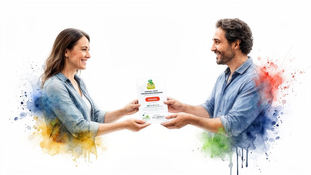
Let’s get one thing straight: great graphic design for nonprofits isn’t just about making things look nice. It’s about making your mission unforgettable. When done right, design builds trust in a heartbeat, shouts your purpose from the rooftops, and inspires the very action—donations, volunteers, support—that keeps your organization moving forward. If you're a local nonprofit in Northwest Indiana, smart design is your key to standing out and connecting with the community.
Why Smart Design Is Your Mission's Biggest Ally
When you're running a nonprofit, every single dollar gets a second look. "Graphic design" can feel like a "nice-to-have," something to think about after the real work is funded. But that’s a huge mistake. Smart design isn't a line-item expense; it's one of the sharpest tools you have for actually achieving your mission.
Think of it this way: your visuals are your first handshake. Before a donor reads a word of your appeal, they see your letterhead. Before someone in Portage, Indiana signs up to volunteer, they land on your website. That split-second visual impression either screams "we've got this" or whispers "we're a little disorganized."
Design That Builds Trust and Credibility
A professional, consistent look tells the world your organization is stable, serious, and ready to make a difference. On the flip side, clashing logos, hard-to-read flyers, and cluttered websites can accidentally tell a story of chaos, making potential supporters think twice.
This isn't just a hunch; it's a fact. A staggering 75% of people judge an organization's credibility based on its website design alone. For a nonprofit trying to earn community trust, a polished, professional presence isn't optional—it's essential.
Turning Visuals into Fundraising Power
But great design doesn't just build trust. It actively goes to work raising money and getting people involved. It makes your calls to action pop, your impact stories hit harder, and your entire mission easier to grasp at a glance.
Connecting Design Investments to Mission Wins
See how specific design efforts translate into tangible outcomes for your nonprofit.
Strategic Design Investment | Real-World Mission Impact |
|---|---|
A compelling annual report design | Showcases your impact with clarity, encouraging repeat donations and wowing grant committees. |
A highly visible "Donate Now" button | Makes giving easy and immediate, directly boosting online contributions. |
Consistent social media templates | Builds brand recognition in crowded feeds, leading to higher engagement and more followers. |
Professional event signage | Creates a polished, welcoming vibe that improves the attendee experience and brings them back next time. |
These aren't just decorative touches; they're strategic assets that work for you. Smart choices, like using well-designed donor walls to inspire prospective donors, can become silent fundraisers, constantly reminding supporters of the community you've built together.
We’ve seen firsthand with local Northwest Indiana nonprofits how a simple redesign of a donation appeal letter can double its response rate. It’s not magic; it’s just clear communication powered by thoughtful design.
From Portage, Indiana, to the greater Chicagoland area, the nonprofits that invest in their visual identity see a direct return. They attract more volunteers, secure more grants, and build a loyal base of supporters who feel a real connection to the cause.
It’s time to stop thinking of design as a cost. Start seeing it for what it is: your mission's most effective ally. Ready to put your design to work? Call Creative Graphics Solutions at 219-764-1717.
Your Brand is More Than Just a Logo
Let's be real: your logo is the handshake. It’s the first impression. But your brand identity? That’s the entire conversation that follows. It's the visual heartbeat of your mission, telling a consistent story across every single flyer, social media post, and thank-you letter you send out.
Moving beyond just the logo is where the real magic happens. It's how you transform your organization from just another name into a memorable, trusted presence in your community.
Good graphic design for nonprofits isn't about just slapping your logo on everything and calling it a day. It’s about building a smart, cohesive visual system that communicates who you are and what you stand for—instantly. This system is built on a few core pillars that all work together to give your mission a distinct, recognizable personality.
Define Your Visual Language
Before you even think about designing a single thing, you need to lock down your brand's core visual components. Think of these as the building blocks that ensure everything you produce looks like it came from the same trusted source.
Color Palette: Colors aren't just for decoration; they create a feeling. A palette of bright, energetic colors might be perfect for a youth sports program, while a more muted, earthy scheme could better represent an environmental cause. Aim for 3-5 primary and secondary colors that truly reflect your mission’s vibe.
Typography: The fonts you use are your brand’s voice, but in text form. A modern, clean sans-serif font can feel direct and accessible. A classic serif font might convey a sense of tradition and authority. Pick a primary headline font and a secondary body font that are easy to read and play well together.
Imagery Style: How do you show your work in action? Your photos and graphics need to have a consistent feel. Will you use bright, candid shots of volunteers? Or maybe professional, studio-lit portraits of the people you serve? You could even go with custom illustrations. Decide on a style that genuinely represents your community and your work.
These elements become the foundation of a simple style guide—a one-page document that acts as your North Star for everything visual. We helped a small animal shelter in Portage, Indiana, create one, and it was a total game-changer for them. Suddenly, their volunteers could create on-brand social posts, and their fundraising appeals immediately looked more professional and trustworthy.
A brand identity isn’t about a bunch of rigid rules; it’s about creating a flexible framework. The goal is to build recognition so that a supporter in Chicagoland instantly knows a mailer is from you, even before they spot your logo.
Do a Quick Brand Audit
To figure out where you’re going, you’ve got to know where you stand right now. Take an hour. Seriously, just one hour. Gather all your current materials—your website, brochures, social media profiles, newsletters. Lay it all out and ask yourself some honest questions.
What feeling do these materials give off? Hopeful? Urgent? Professional? Or maybe just... scattered?
Is the message consistent? Does your Facebook page look like it even belongs to the same organization as your annual report?
What’s actually working? Maybe your event flyers always get a great response. Figure out why.
Where are the weak spots? Is your website looking a little dated? Are your emails super easy to ignore?
This simple audit will show you exactly where the gaps are. It tells you where a little design effort will make the biggest impact. The goal isn’t to overhaul everything at once, but to spot one or two key areas where a refresh can seriously boost your credibility and connection. You can learn more about building a strong visual foundation with professional logo design.
Align Your Visuals With Your Mission
Every single design choice should tie directly back to your core purpose. This is about thinking beyond what just "looks good" and considering how your visuals actually support your values.
For example, if your nonprofit is all about sustainability, the materials you produce should reflect that. Using earth-friendly promotional products isn't just a nice touch—it's a way to show you practice what you preach.
This kind of alignment builds a much deeper layer of trust. When your visual identity, your actions, and your mission are all in sync, you create a powerful, authentic brand that supporters are genuinely proud to stand behind. Building this identity is the most critical step in turning casual observers into lifelong advocates.
If you're ready to define your brand's visual heartbeat, give Creative Graphics Solutions a call at 219-764-1717.
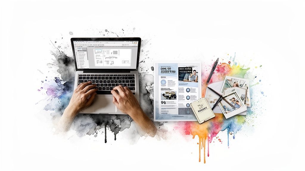
Creating Essential Materials That Drive Action
Okay, you’ve got your brand identity sorted. Now for the fun part: creating the stuff that actually gets people to act. Let’s be real, graphic design for nonprofits isn’t about making pretty pictures—it's about creating tools designed to get a specific response. A donation. A volunteer sign-up. A share on social media. These materials are the workhorses of your mission.
Think of it this way: every single piece you create is a chance to tell your story and connect. Your annual report’s job is to build trust and show your impact. Your social media graphics? They need to stop someone mid-scroll. Each asset has a job to do.
This all comes back to your core brand elements—your colors, fonts, and images. They’re the foundation for everything.
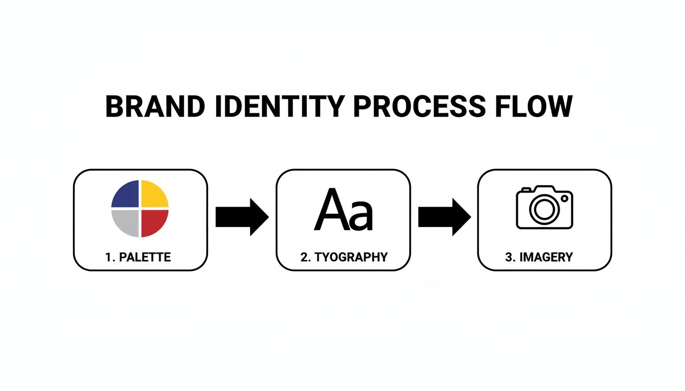
This little chart is a great reminder that when you use these elements consistently, you build a brand that people recognize and trust across the board.
Designing for Donations
Fundraising materials are where your design choices can make or break your budget. The goal here is simple: clarity, urgency, and trust. Every single element should gently (or not-so-gently) nudge a supporter toward making that donation, with zero confusion along the way.
Here are the must-have fundraising assets:
Donation Appeals (Print & Digital): This is a direct conversation with a potential donor. Use a powerful photo that shows your work in action, not a stock photo. Break up the text with clear headings and make the call-to-action button or mail-in slip impossible to miss.
Annual Reports: Please, don't let your annual report be a text-heavy document that puts people to sleep. It should be a celebration! Use infographics to show your numbers, compelling photos, and big, bold pull-quotes from the people you’ve actually helped. A great report makes donors feel like their money was well spent.
Event Materials: From the first save-the-date to the program at the gala, your event materials set the tone. Professional, cohesive design tells your guests this is a well-run, impactful event—one worth their time and money.
We once helped a local Chicagoland charity redesign a simple fundraising appeal, and their response rate jumped by over 30%. The only changes? A clearer headline, a more emotional photo, and a donation button that popped off the page. That’s the power of smart design.
Materials for Outreach and Awareness
While donations pay the bills, a strong community is what keeps a nonprofit alive long-term. Outreach materials are all about grabbing attention, teaching people what you do, and getting them involved.
Your social media feed, for example, is a constant fight for attention. Generic, low-effort graphics get scrolled past in a heartbeat. But a feed that’s visually consistent and interesting? That can turn casual followers into die-hard advocates.
Key outreach materials to get right:
Social Media Graphics: Create a few simple, branded templates for different kinds of posts—event promos, volunteer spotlights, impact stats. This saves a ton of time and makes your feed look sharp. Consistent use of your brand colors and fonts makes your posts instantly recognizable.
Email Newsletters: Your newsletter should be a welcome sight, not another email to delete. Use a clean, mobile-friendly layout with a clear hierarchy. Break up the text with photos and buttons to guide people to your most important stuff, like a new blog post or a volunteer form.
Brochures and Flyers: Believe it or not, print isn't dead. A well-designed brochure is perfect for leaving with potential partners or handing out at community events in places like Portage, Indiana. Just make sure it clearly states your mission, who you help, and how people can get involved.
For a lot of these pieces, the quality of the printing is just as important as the design. To make sure your materials look as good in hand as they do on your screen, check out our professional printing services.
Ultimately, creating these materials is about building a library of tools you can use to push your mission forward. When you apply your brand identity consistently and focus on the one action you want each piece to drive, design stops being an expense and becomes an engine for impact.
For help crafting materials that actually get results, call our team at 219-764-1717.
Smart Design on a Nonprofit Budget
Let's get real about the biggest hurdle for nearly every nonprofit: the budget. When you’re stretching every single dollar, splurging on graphic design can feel like a luxury you just can’t afford. But here’s the thing—great design doesn't have to be expensive. It just has to be smart.
With the right strategy and a few clever tools, you can create professional, mission-driven visuals that connect with donors without draining your resources.
This isn’t just a nice-to-have anymore. The global graphic design market was valued at around $45.8 billion in 2021, and branding alone made up about $3 billion of that. That tells you something important: organizations everywhere are realizing that strong visuals are critical for cutting through the noise. You can read more about the growth of the design market on findstack.com.
Free and Low-Cost Design Tools
Forget about pricey software subscriptions. A whole new world of user-friendly tools has opened up, putting some serious design power right at your fingertips.
Canva for Nonprofits: Honestly, this is a total game-changer. If you’re an eligible nonprofit, you can get a premium Canva account for free. It’s packed with templates, stock photos, and drag-and-drop features perfect for knocking out social media posts, flyers, and simple reports.
Adobe Express: Another fantastic free option that gives Canva a run for its money. It's especially good for creating quick videos and web pages, giving you more dynamic ways to tell your story.
Photopea: Need to do some heavier photo editing but can't stomach the cost of Photoshop? Photopea is your new best friend. It’s a free, web-based editor that looks and feels remarkably similar.
These tools are built for non-designers, which means your staff or a dedicated volunteer can start producing clean, on-brand materials almost immediately.
Templates: Your Secret Weapon for Speed and Consistency
If you want to maximize your time and resources, templates are the answer. They save an incredible amount of work and, more importantly, ensure everything you create looks polished, professional, and consistent.
Stop starting from scratch every single time. Instead, build a handful of core templates for your most common needs:
A go-to design for social media announcements.
A clean layout for your email newsletter.
A branded template for event flyers.
A simple format for volunteer "thank you" cards.
By putting in a little time upfront to create these templates, you empower your whole team to create on-brand content on the fly. This is how you get that high-end, cohesive look without the high-end budget.
Finding High-Quality Free Photos
Authentic, compelling photos make your mission feel real, but professional photography can be a budget-killer. Luckily, there are some incredible places to find free, high-resolution images that don't scream "cheesy stock photo."
Here are a few of our favorites:
Unsplash: Known for its artistic, high-quality photos from a global community of photographers.
Pexels: A huge library of both photos and free videos.
Pixabay: Another massive collection of images, illustrations, and vector graphics.
A word of advice, though: while these sites are great, nothing beats the real thing. Always prioritize using photos of your own team, your volunteers, and the community you serve. Nothing connects with a supporter more than seeing the real people behind the mission.
Smart Sourcing for Local Printing
For our fellow nonprofits in Northwest Indiana and the Chicagoland area, finding a good, affordable printer is key. Local print shops often give you better service and are willing to work with you to find cost-effective options for your annual reports, brochures, or event banners.
At Creative Graphics Solutions, we help local organizations with this all the time. Sometimes a tiny tweak to the paper size or stock can lead to big savings. Don't be afraid to ask a local expert for their advice.
Sticking to a budget is all about making savvy choices. By using free tools, creating smart templates, and sourcing your materials wisely, you’ll prove that a small budget can still deliver a huge impact. And if you ever need a hand getting your graphics just right, you can always order specific design projects from our team.
Finding the Right Design Partner for Your Mission
Eventually, every nonprofit hits a wall with the DIY approach. Those Canva templates that were a lifesaver last year now feel a little… stale. Your mission is growing, your impact is expanding, and you know you need a more professional look to match.
First off, that’s a great problem to have. It means you’re succeeding.
But diving into the world of creative partners can feel overwhelming. Who can you trust to tell your story visually? The options seem endless, but figuring out the key differences will help you make a smart choice that actually serves your cause. This decision is a huge investment in your clarity, credibility, and connection with donors and the community.
Freelancer vs. Studio vs. Volunteer
Each of these creative partners brings something different to the table. The right fit really comes down to your budget, the project's scope, and your specific needs.
The Volunteer Designer: A skilled volunteer can be an absolute game-changer, especially for one-off things like an event flyer or a few social media graphics. They’re passionate and obviously cost-effective, but their availability can be unpredictable. This route works best for smaller, clearly defined tasks.
The Freelancer: Hiring a freelancer gives you professional-grade skills without the overhead of a big agency. They're perfect for project-based work like designing a logo, a new brochure, or your annual report. You get dedicated expertise focused on one specific need.
The Design Studio: When you partner with a studio, you get a whole team in your corner. You’re not just hiring a designer; you’re getting strategists, project managers, and a whole toolbox of services from branding to printing. This is the way to go for a full brand overhaul or if you need a long-term partner for ongoing support.
Choosing a partner isn’t just about getting a pretty final product. It’s about finding a collaborator who understands the unique heartbeat of nonprofit work—someone who gets that every design choice has to connect directly back to your mission.
Questions to Ask Any Potential Design Partner
Before you sign on the dotted line, you need to ask the right questions. Think of it less like an interrogation and more like a conversation to make sure you’re on the same page with vision, process, and values.
Here’s a quick checklist to get you started:
Have you worked with nonprofits before? Honestly, this is a big one. A designer with nonprofit experience already understands the world of tight budgets and mission-first messaging. Always ask to see their portfolio of work for other organizations.
How do you approach a new project? You want a partner who leads with strategy, not just pretty pictures. They should be asking you a ton of questions about your mission, audience, and goals before they even start talking about colors and fonts.
What does your design process look like? A true professional will have a clear, step-by-step process. It should cover discovery, concepts, revisions, and final delivery so there are no surprises along the way.
How do you handle feedback and revisions? The best creative work is collaborative. Make sure their process includes rounds of feedback and that they’re genuinely open to your input.
What do you need from us to get started? This question tells you a lot. A great partner will immediately ask for a creative brief. Let’s talk about that next.
The Secret to Great Results: The Creative Brief
Want to know the secret to getting design work you absolutely love, on time and on budget? It’s not magic. It’s a well-written creative brief.
A brief is just a short document—usually a page or two—that outlines everything your design partner needs to know to knock the project out of the park. It is the single most important tool for getting everyone on the same page. A solid brief prevents miscommunications, cuts down on endless revisions, and leads to a much, much better final product.
Think of it as the roadmap for your project. When you provide this clarity upfront, you empower your designer to focus their creativity on solving the right problem. It’s the foundation for a successful partnership and is absolutely essential for effective graphic design for nonprofits.
Your brief should be short but packed with the important stuff. Here’s what to include:
Your Mission & Audience: In a sentence or two, what do you do? Who are you trying to reach with this specific project?
The Project Goal: What’s the one thing you want this design to achieve? (e.g., "Increase online donations by 15%," or "Drive 100 new volunteer sign-ups.")
The Key Message: If people remember only one thing, what should it be?
Tone & Feeling: How should this design make someone feel? Inspired and hopeful? Urgent and motivated?
Mandatory Elements: Your logo, website URL, any specific text, or a call to action that has to be there.
Timeline & Budget: Be upfront about your deadlines and what you can spend.
Here at Creative Graphics Solutions, we've helped countless businesses and nonprofits throughout Northwest Indiana and the Chicagoland area find their visual voice. We believe in collaboration, not just transactions.
Ready to find the right partner for your mission? Give us a call at 219-764-1717 to talk about your project.
Your Nonprofit Design Questions, Answered (FAQ)
Jumping into the world of professional design for your nonprofit can bring up a ton of questions. You know your mission like the back of your hand, but translating that passion into something visual? That’s a whole other ballgame.
We get it. Here are the straight-up, no-fluff answers to the questions we hear most often from nonprofits doing amazing work. Let's clear the air so you can get back to changing the world.
How Much Should We Actually Budget for Design?
There’s no magic number here. The right budget is all about what you need to accomplish right now. A brand-new nonprofit might spend a few hundred dollars on a solid, professional logo and a simple brand guide. Think of it as the non-negotiable foundation.
A more established organization, on the other hand, might put aside 5% to 15% of its annual communications budget for ongoing design work. That covers everything from the annual report and fundraising appeals to social media graphics and event banners.
The trick is to stop thinking of design as a "cost" and start seeing it as an investment in your mission. Figure out your most critical need—which is almost always your brand identity—and build out from there as you grow. We’re always happy to help local businesses and organizations in Northwest Indiana figure out a plan that makes sense for their budget.
Is It Okay to Just Use a Volunteer for Our Design Work?
A passionate, skilled volunteer can be an absolute lifesaver, especially when you’re starting out and every dollar counts. They can whip up flyers, social graphics, and other daily essentials that keep you moving forward.
But—and this is a big but—it’s smart to know the potential hiccups. Volunteers have their own lives and priorities, which can sometimes mean missed deadlines, inconsistent quality, or just plain disappearing when you need them most.
For the big stuff—your logo, your brand strategy, your website—we always recommend partnering with a professional. It’s a one-time investment that gives you a strategic, high-quality foundation that staff and future volunteers can easily and consistently build on.
What's the Single Most Important Thing We Should Design?
If you can only put your resources into one thing, make it a professional, meaningful logo. No question.
Your logo is the visual anchor for everything you do. It’s on your website, your donation button, your social media pages, your letterhead, and your event signs. It's everywhere.
A strong logo does the heavy lifting for you. It builds instant recognition, communicates your purpose without a single word, and creates a sense of trust with donors and supporters. It is, without a doubt, the hardest-working piece of design you will ever own.
How Can We Even Measure the ROI of Graphic Design?
This is easier than it sounds. Measuring the return on your design investment is all about connecting your visuals to a specific action. You can track real, tangible numbers that show a direct line between better design and better results.
Before you start any design project, set a clear, measurable goal. That way, you can point to the data and show your board, donors, and stakeholders exactly how your investment paid off.
Here’s what that looks like in the real world:
Website Redesign: After launching the new site, track the increase in online donations or volunteer sign-ups. Did the numbers go up? That's your ROI.
Email Campaigns: A/B test a professionally designed email template against your old one. The one with the higher click-through rate wins, and the difference is your proof.
Event Promotion: Compare ticket sales for an event promoted with a killer new flyer to attendance at past events that used a basic, homemade one.
When you connect design to data, it’s no longer just a pretty picture. It becomes a powerful, undeniable driver of your mission's success.
Ready to get clear answers for your organization's specific design needs? The team at Creative Graphics Solutions is here to help nonprofits in Portage, Chicagoland, and beyond. Give us a call at 219-764-1717 or request a free quote today.
Comments