
What Is Visual Hierarchy and How It Guides Customers
- rossballing
- Feb 11
- 11 min read
Ever looked at a billboard and instantly knew what to focus on? That’s visual hierarchy in action. It’s the secret sauce designers use to guide your eyes, making sure you see the most important stuff first. For a small business owner, understanding what is visual hierarchy isn't just a design lesson; it's a powerful tool that turns your marketing into a customer-grabbing machine.
Think of visual hierarchy as your silent sales pitch. When a potential customer in Portage, Indiana, spots your work van or a family in Chicagoland glances at your flyer, you have seconds to make an impact. A design without a clear visual path is just noise—it forces people to work too hard to figure out what you want them to do.
But a design with a strong visual hierarchy? It does the heavy lifting. It puts the spotlight on your most critical info, making sure your message lands instantly. This controlled flow is everything when it comes to hitting your business goals.
For example, a smart hierarchy will:
Grab attention immediately. It makes your best offer or biggest benefit the first thing people see.
Boost clarity and understanding. It organizes information logically so customers aren't hit with a confusing wall of text.
Drive specific actions. It tells people exactly what to do next—call your number, visit your website, or stop by your shop.
A design where everything is important ultimately means nothing is important. The point is to create a visual roadmap that leads your customer straight to the action you want them to take.
At Creative Graphics Solutions, we build this roadmap into every project, from vehicle wraps to business cards. We get that for a local business, every piece of marketing has to pull its weight. By mastering visual hierarchy, we make sure your key message—like a special offer or your phone number 219-764-1717—is always the star. This approach is a cornerstone of building a strong brand identity, which you can read more about in our guide to creating brand guidelines for your small business. It’s how we turn simple designs into powerhouse tools for growing your business.
The 6 Essential Principles of What Is Visual Hierarchy
So, how do you actually get customers to look where you want them to? It’s not magic; it’s a toolkit of six core principles that designers live by. Getting these right is the secret to turning a messy design into a marketing machine for your Northwest Indiana business.
These ideas aren't new—they come from Gestalt psychology principles from the 1920s, which explain how our brains automatically find patterns in what we see. This deep understanding of how people perceive the world is what makes modern graphic design so effective.
Think of these principles like ingredients. Each one has its own job, but they work together to create a final product that just feels right. Let's break them down.
Size and Scale
This one’s a no-brainer: bigger things get noticed first. Our eyes are naturally pulled toward larger elements because we subconsciously assume they’re more important.
For a local HVAC company in Portage, this means slapping your emergency service phone number on your van wrap in the biggest font possible. When someone's AC dies in July, that number is the only thing they care about, and its size should scream "look here!"
Color and Contrast
Bright colors and sharp contrast are impossible to ignore. Think of a neon yellow "Wet Floor" sign—you can't miss it. Contrast is your best friend for separating parts of a design and yanking the eye toward what matters most.
This could be a salon in Valparaiso using a bold, bright color for its "Book Now" button on its website. That one small, high-contrast choice makes the most important action on the page pop.
Typography
Typography is more than just picking a cool font. It's using different font sizes, weights (bold or italic), and styles to create a clear pecking order for information. A newspaper is the classic example: you read the giant headline first, then the slightly smaller subheadings, and finally the body text.
This visual pyramid shows you exactly how that works, starting with the headline to grab attention, then the subhead for context, and finally the body for all the details. This structure guarantees your main message gets seen first, leading the reader down a logical path.
For a local Chicagoland restaurant, this is as simple as using a big, punchy font for the daily special on a menu board while keeping the regular items in a clean, standard font.
Proximity
Things that are close to each other are seen as a single group. Proximity helps you organize information and cut down on clutter by visually tying related items together.
It’s why on a contractor’s flyer, you’d cluster all your contact info—phone, email, website—together in one spot. This simple grouping tells the reader, "Hey, all this stuff goes together."
Alignment
Alignment creates a clean, intentional look. When every element on the page lines up along an invisible grid, the whole design feels connected and professional instead of scattered and chaotic.
A well-designed business card is a perfect example. The logo, your name, and your contact details are all neatly aligned, creating a solid first impression that builds trust.
White Space
Also called negative space, this is the empty area around your design elements. Far from being "wasted," it’s one of the most powerful tools in your arsenal. White space gives your content room to breathe, kills clutter, and improves focus and readability.
White space is what lets the important stuff shine. It’s the silence between the notes that makes the music beautiful.
Think about a luxury brand’s logo—it’s often surrounded by empty space. That signals sophistication and funnels all the focus right to the brand itself.
Here at Creative Graphics Solutions, we use all six of these principles to build designs that don't just look pretty—they get results. Give us a call at 219-764-1717 and let’s talk about how we can put them to work for you.
Visual Hierarchy in Action for Local Businesses
Theory is great, but seeing visual hierarchy work its magic in the real world is where it gets fun. For a small business owner in Northwest Indiana, a smart design isn't just about looking good—it's about getting more calls, selling more products, and improving your bottom line.
Let's ditch the textbook talk and look at how these principles create real results for businesses you see every day around the Chicagoland area.
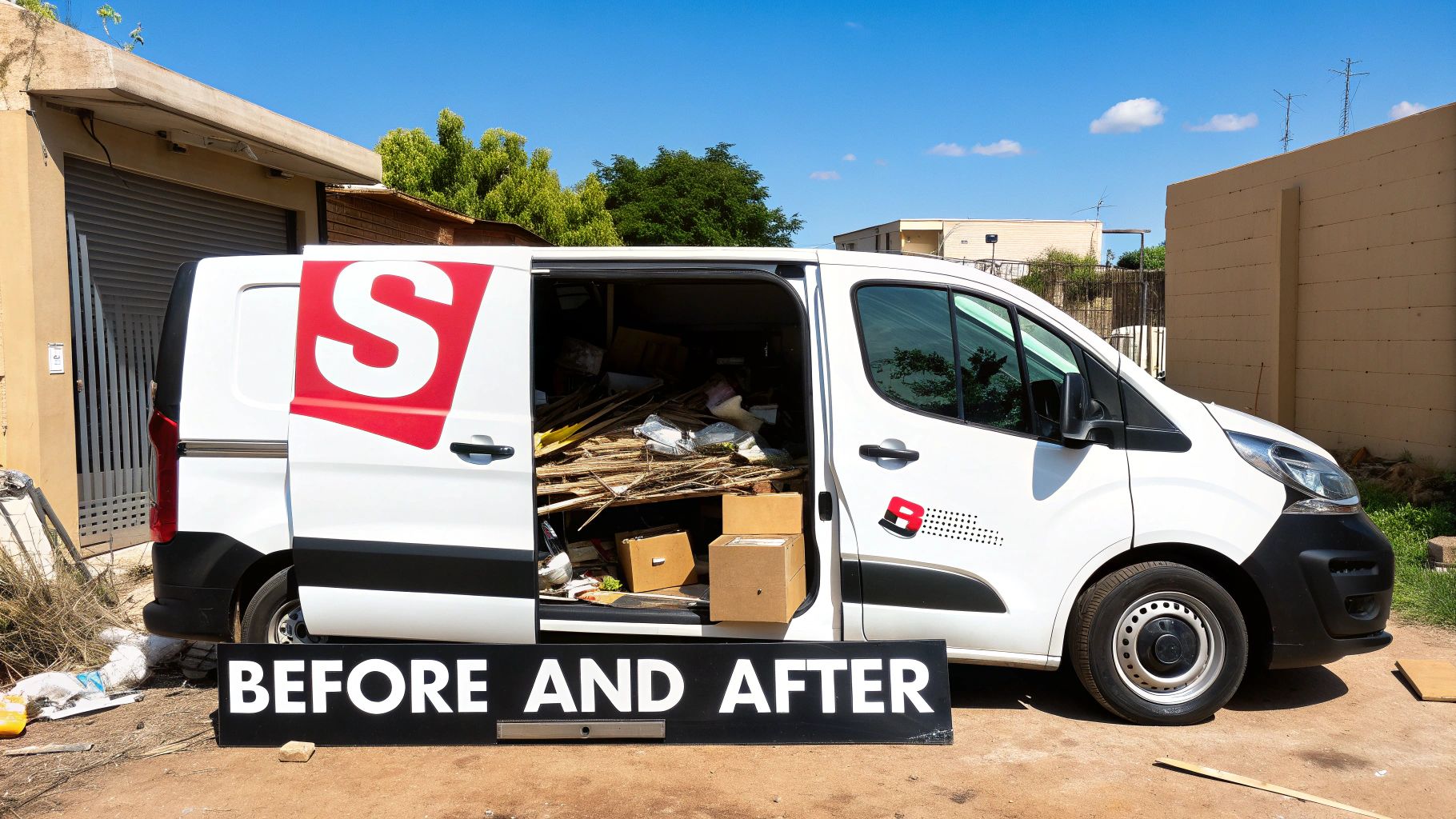
From Cluttered Van to Lead-Generating Machine
Picture a local contractor’s van. We’ve all seen the "before" version: a jumbled mess of text listing every service, a tiny logo, and contact info buried at the bottom. The designer tried to make everything important, which means nothing was.
Now, let's apply visual hierarchy for the "after":
Size & Scale: The company name and phone number get super-sized. When that van is driving down the highway, people have seconds to catch the important stuff.
Proximity & White Space: Instead of a laundry list, we group the top three services into a clean, easy-to-read list with plenty of breathing room. This makes the offerings scannable at a glance.
Contrast: That phone number gets a high-contrast color that pops off the van’s background, making it impossible to miss.
The result? The van transforms from a rolling business card nobody can read into a mobile billboard that actively hunts for leads. We go way deeper on this in our guide to why a vehicle wrap will make your business stand out.
The Salon Menu That Actually Sells
Let's step inside a Portage salon. Their old service menu was a classic "wall of text"—a single, long column where a $15 brow wax had the same visual weight as a $250 specialty treatment. Customers had to hunt for what they wanted, often defaulting to their usual because finding something new was too much work.
Here’s how a redesign using visual hierarchy flips the script:
A well-designed menu shouldn't just list services; it should strategically upsell them. It guides the customer's eye right to your most profitable offerings.
Before: The Confusing List
All services in the same font size and weight.
No clear sections or groupings.
Special packages and high-margin services get lost in the noise.
After: The Strategic Sales Tool
Typography: High-profit services like "Balayage Packages" get a bigger, bolder font.
Proximity: Services are now grouped into logical categories like "Color Treatments," "Styling," and "Add-Ons," with clean headings.
Color & Contrast: We highlight a "Featured Monthly Special" with a colored box or a slick icon, drawing immediate attention.
This new menu doesn't just inform; it persuades. It makes the premium services feel special and nudges customers to explore options they might have otherwise ignored.
A Food Truck Menu Board That Speeds Up the Line
Finally, imagine a food truck in Valparaiso during a slammed lunch rush. A confusing menu board creates a bottleneck. If people can't quickly decide what they want, the line gets longer, and hungry customers might walk away.
By applying visual hierarchy, we design a menu that gets orders moving faster. We use size to make "Best Sellers" or "Combo Deals" the most obvious items. We use alignment and white space to create a clean grid that’s easy to scan. The result is a better customer experience and more sales per hour.
These examples show that understanding what is visual hierarchy is about more than just making things look pretty. It's a business strategy. Here at Creative Graphics Solutions, we translate these design principles into real-world growth for local businesses. Ready to see how we can transform your marketing? Give us a call at 219-764-1717.
Common Visual-Hierarchy Mistakes to Avoid
Knowing the principles is one thing. Spotting the traps that even smart business owners fall into is the real game-changer. We’ve seen countless DIY marketing efforts here in Northwest Indiana fizzle out, not because the idea was bad, but because the design accidentally killed the message.
Understanding what is visual hierarchy also means knowing what not to do. Dodge these common mistakes, and your marketing will instantly look more professional and work harder for you.
The Dreaded Wall of Text
This is the number one offender. It happens when a business tries to cram every last detail onto a flyer or webpage without any room to breathe. The result is an intimidating block of words no one will read.
Your customers are busy. When they see a wall of text, their brains check out. Remember, white space isn't wasted space; it’s a powerful tool that makes your key points pop.
The "Everything Is Important" Trap
This is the design equivalent of shouting everything at once. When you make everything big, bold, and bright, you just create visual noise. If every element is screaming for attention, then nothing stands out. Your viewer has no clue where to look first and just moves on.
Effective design is about making tough choices. You have to pick the single most important piece of information and give it the spotlight. Everything else is the supporting cast.
A great design is ruthless with its priorities. For a contractor in Portage, that’s probably your phone number. For a Chicagoland restaurant, it might be the daily special. Pick your star player and build the design around it.
Low-Contrast Colors That Hide Your Message
This one is subtle but deadly. Using text colors too close to the background color—like light gray text on a white background—makes your message practically invisible. It's a nightmare for people with visual impairments and harder for everyone to read.
Your message needs to be legible in a split second. Stick to high-contrast pairings like dark text on a light background. This ensures your contact info and calls to action are crystal clear. Getting this right pays off; data shows that designs using size and contrast to highlight key elements can see 58% higher click-through rates than cluttered ones. You can learn more about visual hierarchy's impact on user experience.
Avoiding these pitfalls is a huge part of what we do at Creative Graphics Solutions. We help local businesses steer clear of these common mistakes so their marketing investment actually pays off. If you think your designs might be falling into these traps, give us a call at 219-764-1717. We can help you fix them.
A Practical Checklist for Your Marketing Materials
Alright, time to put on your creative director hat. This isn't a test—think of it as a new lens for looking at your designs. It helps you shift from being just a business owner to an informed critic, empowering you to spot what's working and what's not.
Use these simple yes-or-no questions to give your marketing a quick audit.
Your Website Homepage
Your website is your digital handshake. It’s often the first impression a customer gets, so it needs to guide them exactly where you want them to go.
Is your main call-to-action (like "Request a Quote") the most obvious thing on the page?
Can a new visitor figure out what you do in five seconds flat?
Are you using headlines and subheadings to break up the text and lead their eyes down the page?
Your Business Card
A business card is a tiny but mighty piece of your brand. Space is limited, so every element has to earn its spot.
Is your name or company logo the first thing that grabs your attention?
Is your contact info grouped together and dead simple to find?
Is there enough breathing room (white space), or does the card feel cluttered?
A Flyer or Brochure
Flyers are scanned in a heartbeat. The hierarchy here needs to be extra sharp to grab attention and get your message across in seconds.
Does a single, bold headline instantly shout the main offer or benefit?
Can you find the event date, location, or your phone number in less than three seconds?
Does the design use color and contrast to make the most critical details pop?
Your Vehicle Wrap
For contractors and service businesses here in Northwest Indiana, a vehicle wrap is your mobile billboard. Clarity from a distance is everything.
From 50 feet away, can someone instantly read your company name and phone number?
Are your key services listed in a simple, scannable way?
Does the most important info stand out, or is it lost in a busy background?
The ideas behind this checklist are nothing new. The legacy of visual hierarchy goes back to the Gutenberg Bibles in the 1450s, where massive illuminated letters told people where to start reading. That same concept is just as powerful today. Modern data shows that using strong contrast to create a clear visual path can boost comprehension by over 60%. You can discover more insights about guiding the viewer's eye on rmcad.edu.
If your materials didn't pass the test, don't sweat it. That's why we're here. Understanding the difference between a DIY design and a professional one is a big deal, and you can learn more about why hiring a local studio beats national print shops. Give the team at Creative Graphic Solutions a call at 219-764-1717, and we’ll help you get an A+.
Got Questions About Visual Hierarchy? We've Got Answers.
We’ve walked through the principles and seen how they play out in the real world. Still, a few questions always pop up when business owners start thinking about their own designs. Let's clear the air so you can move forward with confidence.
Is Visual Hierarchy the Same for a Website and a Business Card?
Not exactly, but the mission is the same. You wouldn’t shout at someone in a quiet library, but you’d have to on a loud construction site. The goal is always clear communication, but the environment changes how you deliver the message.
A business card is a quick handshake. Your logo and name need to hit first, followed by contact info. A website is a guided tour. The hierarchy has layers, leading visitors from a bold headline down a path to specific calls to action.
Can Good Visual Hierarchy Actually Boost My Sales?
One hundred percent. This isn't just about making things look pretty; it's a straight line to your bottom line. When your design makes it simple for customers to find what they need and take the next step, sales happen.
Making your "Request a Quote" button pop with a bright color removes friction. It makes it effortless for a lead to get in touch. A clean, scannable menu at your Portage restaurant can subtly guide diners toward your high-margin specials. It’s about turning design clarity into actual dollars.
Is Visual Hierarchy Just Another Term for Brand Identity?
They’re partners, but they have different jobs. Your brand identity is the what—your logo, colors, and fonts. Visual hierarchy is the how—the way you arrange all those brand ingredients to get a specific point across.
A great brand identity gives you the right ingredients. A smart visual hierarchy is the recipe that turns them into a masterpiece. You need both to create a design that not only looks like your brand but works for your business.
Feeling like your marketing materials could use a professional eye to get the hierarchy just right? The team at Creative Graphics Solutions is here to help businesses across Northwest Indiana turn their designs into powerful sales tools. Give us a call at 219-764-1717 or request a free quote today.
Comments