
How to Create Brand Guidelines for Your Small Business
- rossballing
- Feb 6
- 18 min read
Let's be real. When you're a busy contractor in Portage, Indiana, or you're running a growing salon in Chicagoland, the term "brand guidelines" can sound like a bunch of corporate fluff meant for big-box stores. But trust me, it’s one of the most powerful, down-to-earth tools a local business can have.
Think of it as the ultimate playbook for your business's identity.
This guide on how to create brand guidelines is for the small business owner who wants a stronger, more recognizable brand. It’s a simple document—a single source of truth—that makes sure your new vehicle wrap, your Facebook posts, and the sign on your front door all look and feel like they belong to the same professional, trustworthy company. This isn't about boxing you in with restrictive rules; it's about building a strong, memorable presence that customers recognize in a heartbeat.
Why Brand Guidelines Are Your Business’s Most Valuable Tool
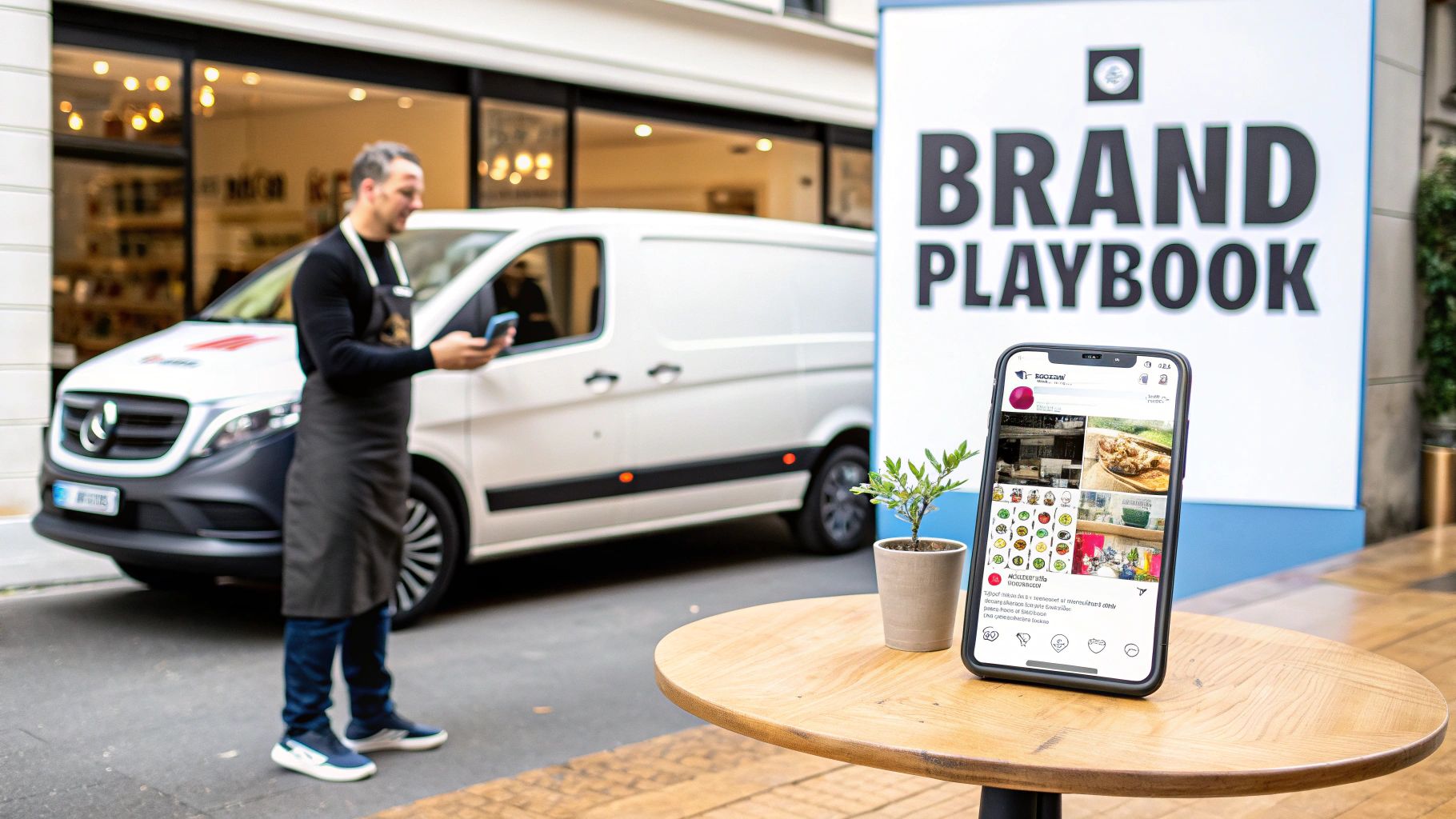
Without a guide, your brand can quickly turn into a messy patchwork of different fonts, colors, and messages. One day your flyers are one shade of blue, the next your van wrap is another. That kind of inconsistency can make your business look disorganized and unprofessional—the last thing you want when you're trying to build a solid reputation in Northwest Indiana.
Consistency Creates Trust and Recognition
Here’s the secret sauce: consistency breeds familiarity, and familiarity breeds trust. When a potential customer sees your logo on a lawn sign and then recognizes that same style and color on your work van a week later, it builds a subconscious sense of reliability. They start to feel like they know you.
A clear set of guidelines puts an end to the guesswork. It answers all those little questions that can trip you up:
What's the exact hex code for our primary blue?
How much space needs to be around the logo?
Should our social media posts sound professional or more casual and friendly?
A Playbook for Growth
Having these rules written down is also a massive time and money saver. It stops costly design mistakes before they happen. Think about it: no more reprinting business cards because the wrong font was used or rewrapping a vehicle because the logo was stretched.
It also makes onboarding new employees or hiring a marketing partner (like us at Creative Graphics Solutions!) a breeze. Instead of a dozen back-and-forth emails trying to explain your vision, you just hand them the playbook.
The proof is in the numbers. While a massive 95% of companies have brand guidelines, only about a quarter of them actually enforce them consistently. The ones that do? They see serious growth. Statistics show that 32% of organizations saw a revenue boost of 20% or more just from having unified brand messaging.
Let's break down what actually goes into a solid set of brand guidelines. It's not as complicated as it sounds, and each piece plays a critical role in keeping your brand sharp and consistent.
The Core Components of Brand Guidelines
Component | What It Covers | Why It's a Game-Changer |
|---|---|---|
Brand Strategy | Your mission, vision, core values, and target audience. The "why" behind your business. | Keeps everyone aligned on the big picture, ensuring your marketing connects with the right people. |
Logo Usage | Rules for your primary and secondary logos, including minimum size, clear space, and don'ts (like stretching or recoloring). | Protects your most valuable visual asset from looking distorted, amateurish, or just plain wrong. |
Color Palette | Your primary and secondary brand colors, defined with specific codes (HEX, RGB, CMYK) for digital and print. | Guarantees your brand colors are exactly the same everywhere, from a website button to a printed brochure. |
Typography | Your designated headline, sub-headline, and body copy fonts, including size and weight guidelines. | Creates a consistent reading experience and reinforces your brand's personality—whether it's modern, traditional, or playful. |
Imagery & Tone | Guidelines on the style of photography, illustrations, and icons to use. Defines your brand's personality and communication style. | Ensures your visuals and your words feel cohesive and authentic, preventing a jarring mix of stock photos and off-brand language. |
Getting these elements down on paper is the first step toward building a brand that not only looks professional but also works smarter for you in the long run.
Brand guidelines aren't about limiting creativity. They're about focusing it. By defining the core elements, you empower your team to create powerful, on-brand materials faster and more effectively.
This guide will walk you through exactly how to create brand guidelines that work for your unique business. If you're looking for more insights on building a powerful brand, check out our other posts on the Creative Graphics Solutions blog. For personalized help, give us a call at 219-764-1717.
Building Your Brand’s Strategic Foundation
Before you even touch a color palette or sketch a logo, we need to talk strategy. This is the soul-searching part of branding, and honestly, it's the most important. It’s what keeps your brand from being just another pretty face. This work ensures every single decision you make—from the copy on your website to the wrap on your company truck—feels authentic and actually works.
Too many business owners get excited and jump straight into the fun visual stuff. I get it. But without this strategic foundation, you're just picking nice colors out of a hat. A brand built on a solid 'why' connects with people on a level a cool logo alone never could.
Clarify Your Mission and Vision
Let's start with the big stuff. Your mission statement is your "what" and "how" for right now. It defines what your business does, who you do it for, and what makes you good at it. It's your purpose, plain and simple.
A plumber right here in Portage, Indiana might have a mission like: "To provide reliable, honest plumbing services that keep Northwest Indiana homes safe and functional."
Your vision statement is different—it's your North Star. It’s about the future and the ultimate impact you want to make. That same plumber’s vision could be: "To be the most trusted and recommended plumbing contractor in the Chicagoland area."
These aren't just fluffy sentences to stick on your 'About Us' page. They're your compass. They guide your decisions and make sure everyone on your team is rowing in the same direction.
Pro Tip: Keep it simple. If your mission and vision are full of jargon or run on for paragraphs, they’re useless. Aim for one clear sentence each. Anyone should be able to read it, get it, and remember it.
Define Your Core Values
Next up: your core values. Think of these as the non-negotiable principles that define your company’s personality and culture. You’re not just listing words; you’re defining how you show up every day. Aim for three to five guiding beliefs that are absolutely central to how you do business.
Are you all about old-school craftsmanship? Unbeatable customer service? Deep community involvement? These are the things that make you different.
For a local trades professional, core values might look something like this:
Integrity: We do the right thing, even when nobody's watching.
Reliability: We show up on time and finish the job we promised. Period.
Craftsmanship: We take pride in our work and never, ever cut corners.
When you nail these down, you attract the right customers, hire the right people, and build a reputation for being more than just another service provider.
Pinpoint Your Ideal Customer
Here’s a hard truth: you can't be everything to everyone. Trying to appeal to the entire Chicagoland area is a fast track to a bland, watered-down brand that speaks to no one.
You have to get laser-focused on your ideal customer. And I mean really specific, way beyond basic demographics like age and location.
What are their real-world problems? What are their goals? What keeps them up at night? For a contractor's ideal client, maybe it's the paralyzing fear of getting ripped off by a shady operator. For a salon owner, it could be the deep desire to finally feel confident and pampered.
Creating a detailed customer profile helps you talk directly to the people who are most likely to become your biggest fans. You’ll know exactly what to say—and where to say it—to make them stop and listen.
Sharpen Your Unique Value Proposition
Okay, last one. You have to be able to answer this question in a heartbeat: "Why should a customer choose you over anyone else?"
Your answer is your unique value proposition (UVP). It’s not just a clever slogan; it’s the concrete promise of value you deliver that your competitors can’t or don’t. Maybe you’re the only one offering a lifetime warranty, or you have a true 24/7 emergency service, or you exclusively use eco-friendly materials.
For example, a local cafe's UVP might be: "The only coffee shop in Valparaiso serving locally roasted, organic coffee with a 100% satisfaction guarantee." It’s specific, it’s different, and it hits on exactly what a certain type of coffee lover is looking for.
Once you have this strategic foundation locked in, the rest of your brand guidelines practically write themselves. You'll intuitively know which colors feel right, what your tone of voice should be, and how to design a logo that truly means something. If you need a hand digging deep to find your brand's core, Creative Graphics Solutions is here to guide you. Give us a call at 219-764-1717.
Defining Your Visual Identity System
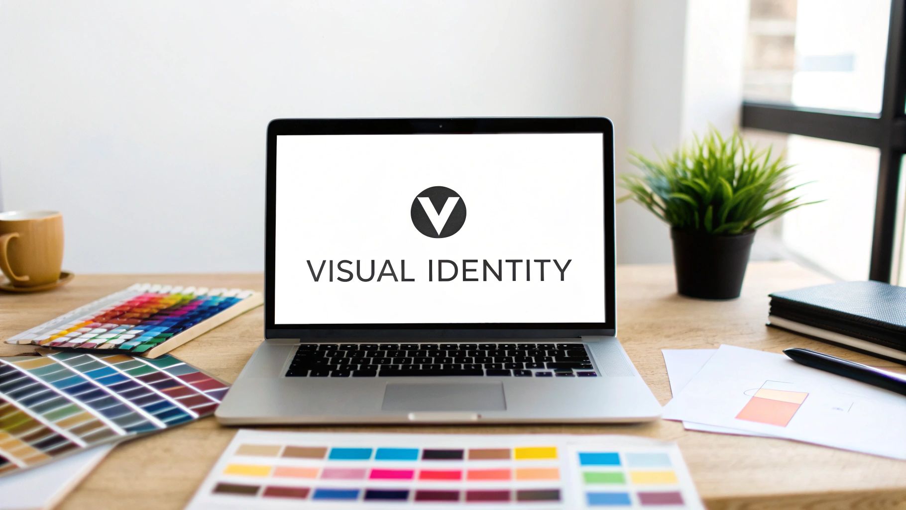
Alright, you’ve done the soul-searching and nailed down your brand strategy. Now for the fun part: making it look good. This is where your mission, values, and big ideas get translated into the colors, fonts, and shapes people will actually see and remember.
Your visual identity is the face of your company. It’s what makes someone choose you over the other guy. Getting these details down on paper is the only way to guarantee a professional, consistent look every single time. This isn't just about picking pretty colors; it's about making deliberate choices that scream "this is us."
Let's build the visual blueprint that will guide everything from your business cards to your company van.
Your Logo Rules and Regulations
Think of your logo as your brand’s handshake—it’s the single most recognizable piece of your identity. So, you have to protect it. Your brand guidelines need to lay down clear, non-negotiable rules for how it should (and shouldn't) be used.
This is how you prevent those little mistakes that make a great logo look amateurish. We’ve all seen it: a logo stretched weirdly on a t-shirt, or one that’s so tiny on a flyer you can’t even read it. These small errors kill your professional vibe.
Your guidelines need to cover a few key things:
Clear Space: This is the logo’s personal bubble. Define a minimum amount of "breathing room" around it to make sure it never looks cluttered or crammed next to other design elements.
Minimum Size: How small can your logo get before it turns into an unreadable smudge? Figure that out for both print and digital, and make it a hard rule.
Incorrect Usage: This is critical. Show visual examples of what not to do. Think stretched logos, squashed logos, weird color changes, drop shadows from 1998, or plopping it on a busy, unreadable background.
Here's a stat for you: 73% of companies say design is what makes them stand out. But if your look is all over the place, you lose all that power. For a local business, clear guidelines prevent things like mismatched signage that confuses potential customers right at your front door.
Building a Versatile Color Palette
Color hits you right in the feels, often before words even have a chance. Your guidelines need to define your color palette with laser precision. Why? So the perfect shade of blue on your website is the exact same shade on your new work van wrap.
Start with your primary colors—usually one to three main players pulled from your logo. Then, flesh it out with a set of secondary or accent colors that play nicely with the main ones.
For every single color, you need to document the specific codes for different jobs:
HEX codes for anything on a screen (like #0A2342).
RGB values also for digital displays (e.g., R:10, G:35, B:66).
CMYK values for anything getting printed professionally (e.g., C:85, M:47, Y:0, K:74).
Pantone (PMS) codes for when you need a perfect color match on things like merchandise or signs.
This level of detail takes all the guesswork out of the equation for your team and any vendor you hire, whether it's the local printer down the street or a web developer across the country.
Demystifying Your Brand Typography
Typography is your brand’s voice, but in visual form. The fonts you pick say a lot—are you modern and clean, or are you traditional and trustworthy? Your guidelines should create a super clear hierarchy for how you use type.
You’ll typically want to pick two or three font families that work well together. One for your big headlines (H1, H2, H3), one for your body text (the paragraphs), and maybe a cool accent font for special callouts or quotes. This simple system makes everything you create look clean and easy to read.
Don't just name the fonts and call it a day. Create a system. For a local contractor, for example, a solid type hierarchy makes quotes and proposals look way more professional and easier for clients to actually understand. It ensures every piece of communication is instantly recognizable.
Sample Typography Hierarchy
A typography hierarchy is just a fancy way of saying "rules for your fonts." It ensures everything looks consistent, from your website to your invoices. Here’s a simple example of what that might look like.
Element | Font and Weight | Recommended Size | Common Use Case |
|---|---|---|---|
Headline 1 (H1) | Montserrat Bold | 36px | Main website page titles, major report headings |
Headline 2 (H2) | Montserrat Semibold | 28px | Section titles on web pages, primary flyer headings |
Headline 3 (H3) | Montserrat Semibold | 22px | Sub-section titles, callout headings |
Body Text | Open Sans Regular | 16px | Paragraph text, email body, general descriptions |
Caption/Label | Open Sans Italic | 14px | Image captions, small labels, form field notes |
See? Having a clear system makes it easy for anyone to create materials that look like they came from the same brand, because they did.
Defining Your Photography and Imagery Style
Last but not least, let's talk pictures. Do the images you use all feel like they're telling the same story? Your guidelines need to outline the style of photography and illustration that fits your brand's personality.
Are your photos bright, airy, and full of smiling faces? Or are they more gritty, detailed shots of craftsmanship in action? Define the mood, the lighting, the subject matter, and even the editing style.
This ensures that whether you’re posting on Instagram or designing a new brochure, your visuals are always backing up the story you want to tell.
By getting all these visual elements documented, you're building a powerful toolkit. For a deeper dive into what makes a visual identity click, check out our guide on what every great logo needs. This system is what separates a brand that looks cobbled together from one that looks polished, professional, and ready for anything.
Need a hand defining your visual system? Give Creative Graphics Solutions a call at 219-764-1717.
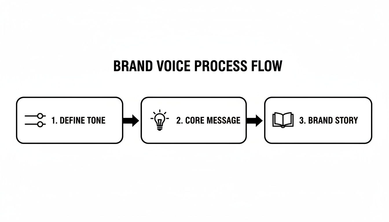
Crafting Your Brand Voice and Tone
If your visuals are your brand’s face, your voice is its personality. It’s how you talk, how you make customers feel, and what separates you from the competition just as much as your logo or color palette.
Without a defined voice, your website copy, social media posts, and even customer service emails will feel all over the place. That’s a surefire way to confuse the very people you’re trying to connect with.
Let's be real: a high-end contractor in Chicagoland shouldn't sound like a teenage TikToker. A funky Portage coffee shop shouldn't sound like a corporate law firm. Nailing down your brand voice and tone is a non-negotiable step in learning how to create brand guidelines that actually work. It’s about making sure that no matter who’s writing for you, it always sounds like you.
The "This, Not That" Framework
The fastest way to pin down your brand's personality is with a simple "This, Not That" exercise. This isn't just about picking random adjectives; it's about defining the nuance and setting clear guardrails for your team.
First, brainstorm a bunch of words that feel like your brand. Then, for each one, add a word that clarifies what you aren't. It’s a game-changer.
Here’s what that looks like in action:
Expert, not Arrogant (We know our stuff, but we're here to help, not talk down to people.)
Friendly, not Overly Casual (We’re approachable and warm, but we still keep it professional.)
Confident, not Cocky (We’re proud of our work, but we let the results do the bragging.)
Clear, not Simplistic (We make complex stuff easy to get, without dumbing it down.)
Witty, not Goofy (We can crack a clever joke, but we’re dead serious about our business.)
This framework is so practical because it gives anyone writing for your brand an instant feel for the right vibe. No more guessing games.
Developing Core Messaging Pillars
Okay, so you've figured out how you sound. Now you need to decide what you're going to talk about.
Your core messaging pillars are the one to three big ideas that should show up in everything you publish. Think of them as the main themes of your brand's story—the stuff that connects back to your strategy and what your customers actually care about.
For a local HVAC business right here in Northwest Indiana, those pillars might be:
Reliability and Trust: Always talking about 24/7 service, certified techs, and no-nonsense pricing.
Community Focus: Highlighting local roots, sponsoring the town's Little League, and knowing the neighborhood.
Efficiency and Savings: Focusing on high-efficiency units, sharing energy-saving tips, and proving long-term value.
Every blog post, every Facebook update, every ad you run should tie back to at least one of these pillars. This keeps your messaging tight, relevant, and way more powerful.
Your brand voice isn't just for marketing. It's how you answer the phone, write an invoice, and handle a customer complaint. A consistent voice at every single touchpoint builds a seamless, trustworthy brand experience.
Crafting Your Brand Story and Tagline
With your voice and messaging locked in, you can start shaping the fun stuff—the stories that bring your brand to life.
Your brand story is your "About Us" narrative that hits customers on an emotional level. It's where you explain why you started this whole thing, what you believe in, and the journey you took to get here. It’s not a sales pitch; it’s a handshake.
Next up, your elevator pitch. This is your 30-second summary of what you do, who you do it for, and why you’re the best choice. It needs to be a concise, powerful tool for networking and those "so, what do you do?" moments.
Finally, your tagline. This is the short, memorable phrase that captures the soul of your brand. Think of it as the period at the end of your brand's sentence—catchy, clear, and a perfect little snapshot of what you're all about.
When you document your voice, messaging, and story, you’re handing your team a playbook for killer communication. It ensures every single word works to build a stronger, more trusted brand. Need a hand shaping a voice that connects with your local audience? Call Creative Graphics Solutions at 219-764-1717.
Assembling Your Brand Guidelines Document
Okay, you’ve done the heavy lifting. You've mapped out your strategy, nailed down your visuals, and given your brand a voice with some real personality. Now what? It’s time to bring all that hard work together into a single, powerhouse tool: your brand guidelines document.
This isn’t about creating a massive, dusty binder that sits on a shelf. The goal here is to build a practical, easy-to-use resource that makes consistency second nature for your whole team—and anyone else you work with. A great brand guide is a living asset that helps people make smart, on-brand decisions without having to guess.
Choosing the Right Format
Forget about complicated software or clunky files nobody can open. For a small business in Northwest Indiana, simplicity and accessibility are everything. The best format is the one your team will actually use.
Here are a couple of winning options we see work wonders for local businesses:
The Shareable PDF: A classic for a reason. A well-designed PDF looks professional, is a breeze to share over email, and can be printed out if needed. It’s perfect for sending to outside partners like printers, web designers, or a team like us at Creative Graphics Solutions.
The Living Google Slides Deck: This is our personal favorite for internal teams. It’s collaborative, cloud-based, and so easy to update. When you tweak your secondary color palette or add a new logo variation, the changes are live for everyone instantly. No more hunting down the "final_final_v3.pdf" file.
The key is to keep it streamlined. You want to make it ridiculously easy for a new hire or a freelance designer to find exactly what they need in under a minute.
Structuring Your Document for Clarity
A messy, disorganized guide completely defeats the purpose. Structure is everything. Think of it like a user manual for your brand—each section should be logical and easy to find. Good structure ensures that finding the right hex code or logo file isn't a frustrating treasure hunt.
Start with the big picture and then drill down into the nitty-gritty. Here’s a simple, effective structure to follow:
Brand Strategy First: Kick things off with your mission, vision, and core values. This sets the stage and reminds everyone why these rules even exist. It's the soul of your brand.
Logo Guidelines: Dedicate a clear section to your logo. Show the primary logo, any secondary versions, and—this is crucial—visual examples of what not to do. Show the stretched, squashed, and recolored logos so no one makes those mistakes.
Visual Identity System: Group your color palette, typography rules, and imagery style together. Display color codes (CMYK, RGB, HEX) clearly and show your fonts in action with headlines and body text examples.
Voice and Messaging: This is where you'll cover your brand voice (the "This, Not That" framework is great here), core messaging pillars, and your official tagline.
This flow takes anyone using the guide on a logical journey, from the brand’s core purpose to its practical, everyday application.
This process of defining your tone, message, and story is the foundation of a brand voice that feels authentic—a cornerstone of your final document.
Getting Your Team On Board
Creating the document is only half the battle. Getting people to actually use it is what really matters. Don't just email the file out and hope for the best. You need a proper rollout.
Schedule a quick team meeting to walk everyone through the new guidelines. Frame it not as a list of restrictive rules, but as a tool designed to make their jobs easier and make the company look more polished and professional.
Key Takeaway: Your brand guidelines are a tool for empowerment, not enforcement. When your team understands how it helps them create better work faster, they’ll be excited to use it. Show them how it eliminates guesswork and boosts their confidence.
Walk them through the guide, point out the key sections, and explain the "why" behind the choices. Make it clear that this document is the single source of truth for any creative or communication task. This one step can turn your guide from just a file on a server into a core part of your company culture.
For help assembling a guide that works for your team, give Creative Graphics Solutions a call at 219-764-1717.
Bringing Your Brand to Life Every Day
Okay, you did the heavy lifting. You’ve defined and documented your brand. But a brand guide sitting in a folder is just a document. Its real power is in the daily grind.
The real work of building a recognizable, trusted brand in Northwest Indiana starts now. Think of your new guidelines as a fresh pair of glasses. It's time to look at everything your business has already put out there—your website, social media profiles, work vans, even your invoices—through this new lens.
This is your brand audit. It’s where you’ll spot the little (and big) inconsistencies and create a battle plan for getting everything aligned.
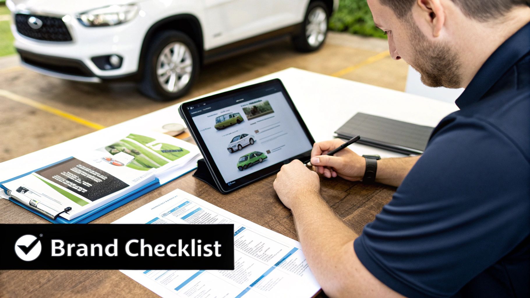
Your Quick-Start Brand Audit Checklist
Grab your new guide and let's walk through a simple audit. This isn't about shaming past decisions; it's about making your future efforts hit harder. A consistent brand can boost revenue by over 20%, so this initial legwork pays for itself fast.
Website & Social Media: Are your profile pictures using the right logo variation? Do your cover photos and recent posts reflect your primary brand colors? Is the tone in your bio and captions hitting that sweet spot you just defined?
Vehicle Wraps & Signage: For so many businesses in Portage, your truck is your biggest, baddest billboard. Does the current wrap use the right logo, fonts, and colors? Don't forget, awesome business signage increases foot traffic and makes your brand impossible to ignore.
Printed Materials: Dig out your business cards, flyers, and brochures. How do they hold up against your new typography and color rules?
Team Communication: Take a peek at recent customer emails or proposals. Does the language line up with that "This, Not That" framework you worked so hard on?
This audit will spit out a clear to-do list. My advice? Tackle the most visible assets first for the biggest and fastest impact.
Weaving Guidelines into Your Daily Workflow
Consistency isn’t a one-and-done fix. It's built through daily habits and muscle memory. Your brand guidelines should become a go-to tool, not a dusty rulebook you forget about.
The goal is to make "on-brand" the default setting for every single decision. Before ordering new t-shirts for the crew, pop open the logo usage section. When you're about to write a Facebook post, give your messaging pillars a quick scan.
This constant reference is how you bake consistency into your company's DNA until it becomes second nature.
Brand guidelines aren't a creative straightjacket. They're a tool for growth and empowerment. They give you and your team the confidence to make quick, smart decisions that strengthen your brand every single day.
Ready to upgrade your brand? Request a free quote today. The team at Creative Graphics Solutions is here to help businesses across Chicagoland build powerful, unforgettable brands. Give us a call at 219-764-1717, and let’s bring your brand to life together.
Burning Questions About Brand Guidelines
We've covered a ton of ground on how to build a killer set of brand guidelines. But I know there are probably a few questions still rattling around in your head. Let's tackle some of the most common ones we hear from small business owners right here in Northwest Indiana.
This quick FAQ should clear up any last-minute "what ifs."
How Long Should My Brand Guidelines Be?
For most local businesses, a lean and mean 5–10 page guide is the sweet spot.
The goal here is clarity, not creating a massive novel that collects dust. It just needs to be comprehensive enough to cover your logo, colors, fonts, and voice, but simple enough for your team to actually use it without getting a headache.
Trust me, a well-organized, easy-to-scan PDF or Google Slides deck is way more valuable than a 50-page book that nobody ever opens.
Can I Create Brand Guidelines Myself?
Absolutely! And honestly, you should. You know your business, your mission, and your values better than anyone. Use this guide to lay all that strategic groundwork for your brand's personality and voice.
But—and this is a big but—when it comes to the visual side of things, it pays to call in a pro.
Refining logo files, dialing in the exact color codes (CMYK, RGB, HEX), and building a professional typography system is where an expert at Creative Graphics Solutions makes a world of difference. It ensures the final result is polished, effective, and technically sound.
How Often Should I Update My Guidelines?
Think of your brand guidelines as a living document, not something carved in stone. It’s smart to give them a quick review at least once a year or whenever your business makes a big move.
Maybe you're launching a new service, targeting a new market in the Chicagoland area, or going through a full brand refresh. Any of those would be a perfect time for an update. You might even find yourself making small tweaks more often as you discover new ways your brand shows up in the world.
The key is to keep it relevant and useful. Need help with branding or design? Contact Creative Graphics Solutions at 219-764-1717.
Comments